One of the things with this site and the counter at the bottom of the page is that I have a pretty good set of stat's showing how you all see the blog. In other words I can see a list of all the browsers used to view the blog along with their screen sizes (before you panic about Big Brother eroding your rights, that's about all i do know about you all and it's no more than
any other site that you visit online!)
My question is a simple one, if you get a chance I'd love to hear from you-Does the blog look ok to you?
By that i mean does it display well on your screen? Do the colours I've chosen make it readable or not? And so on.
Now is your chance to help me shape how the page looks!
2 comments:
Everything looks fine on this end. I really like the white typeset on the blue background.I also like how the links and the pictures are easily accessible. Too bad about losing the "happy faces" tho' :-(
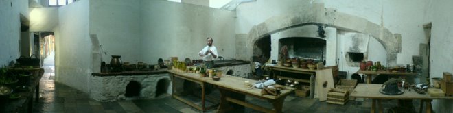
I'm so glad that there is finally a place that conveys accurately and personally how much hard work, research, blood, sweat, and tears-as well as laughter, go into this ongoing, and constantly evolving project. Having seen a few of the week-end presentations, I am amazed at how this diverse collection of food historians manage to bring it all together (even cooking huge beasts on a spit!) whilst engaging the visitors in a constant dialog of fascinating information and display of masterful cookery. Dressed in their own period clothing (that gets dirty, sweaty, and worn),surrounded by authentic furniture, utensils, and accessories (that also get dirty,used,and wear out),it is so easy to believe that you've stepped back into a 16th Century kitchen. It is quite obvious that these chaps love what they're doing! AND they are so good at what they do.
Looking forward to hearing more about the ongoing adventures of this group. Can't wait to hear about your trip "out West".
Go West Young Men!! Yeee-HA!
The pale blue and pinky-orange text work fine for me on the background colour you've chosen. The white text seems to come up a bit bright though.
On another PC, the background came up a much darker blue, and pale blue was brighter. White text seemed a bit fuzzy. This could, of course, all be due to my contrast/brightness settings.
The layout is better than the old Yahoo, and it's quicker to access the photostream.
Certainly agree with Argwyth's comments about the project and you guys. So passionate and totally committed to what you do.
Keep the blog rolling and we're looking forward to the start of this year's cookery at Easter. (And more recipes to try!)
Helen
Post a Comment